MarcusHammarstedt
TLDR
I use code, design and collaboration to produce the highest quality work that delivers business value and makes my team proud
ROLES
- 2020Head of Design@See-Mode
- 2018Lead Design Technologist@Redbubble
- 2016Senior Product Designer@Redbubble
- 2014Senior UI Developer@Intershop
AT A GLANCE
- UI•UX•HTML•CSS•Javascript
- Remote•Hybrid
- Santa Cruz, CA
- USA •Australia•Sweden
UI
Designing and building intuitive and accessible interfaces for complex use cases such as medical diagnostics.
UX
Designing, preparing and conducting qualitative and quantitative research to inform decision making.
Dev
Deploying performant and accessible code to production environments through Git workflows.
Design Systems
Creating, maintaining and educating on design systems for small and large teams.
People
Defining and running inclusive hiring processes. Onboarding, mentoring and coaching others.
Team
Planning and leading sprints. Introducing new team processes and company policies.
EXPERIENCE
I've taken new products to market, led product teams, built and educated on design systems, spearheaded accessibility initiatives and delivered solutions quickly by being pragmatic and applying lean and agile methodologiesTHE HORIZON
With experience spanning multiple disciplines, industries, and organizations, I'm confident in my ability to excel in any role as long as the product is both captivating and meaningful.
While I possess expertise in senior IC design roles, I am also eager to venture into UX Engineering, where I can challenge myself and utilize my entire range of technical abilities.
Feel free to reach out for a chat!
CONTEXT
Redbubble is the leading global marketplace for independent artists to sell their creations on commercial goods like t-shirts, stickers and phone cases. It was founded in 2006 and has grown to support close to 1 million artists who sold to 4 million customers in 2018 alone.
It is available in multiple languages and has offices in Australia, Europe and its largest market, North America.
MY ROLE
As Senior Product Designer I uncovered user needs, validated our hypotheses, contributed to overall strategy, and worked with my product team to come up with a lean approach to delivering our solution.
UI
Solving interaction and hierarchy challenges.
UX
Performing qualitative and quantitative research.
Dev
Prototyping using real code for user testing and performance.
CHALLENGE
The Redbubble platform had evolved over 12 years and accumulated a lot of technical debt. It was using old tech which was causing issues for teams as well as customers since it resulted in:
- Slow product development
- Poor site performance
OBJECTIVE
Deliver a new front-end platform and be the fastest, unique shopping experience our customers had ever seen.
STRATEGY
An initial challenge was to reduce scope. Delivering a new platform with the same feature set as we already had would take a minimum of 12 months.
So how could we go to market early and be lean, deliver incrementally and validate both the new platform and experience?
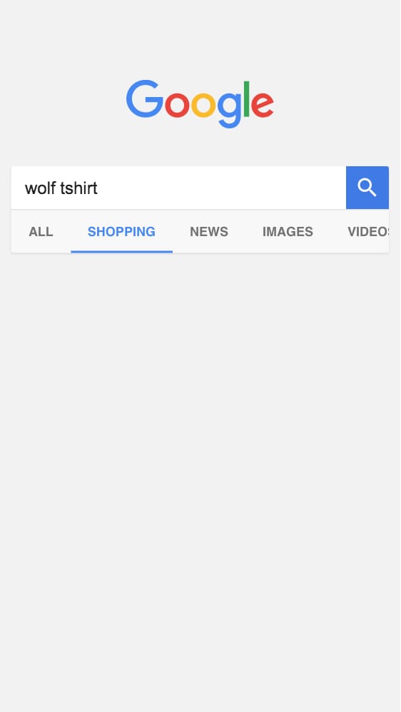
We started looking at analytics data, targeting different user segments and their behaviours to identify an opportunity where we could show a particular segment an experience that was different from the rest of the users on the site. What we found was that a significant amount of traffic to our product pages came from Google Shopping and the majority of these users would bounce within a minute.
This was ideal as it allowed us to show this segment a different experience without it interferring with existing members and customers using the site. It also allowed us to deliver incrementally. To further narrow down the scope we decided to focus on mobile users and the t-shirt product page.
This way our initial scope and approach was reduced to:
- Google Shopping users
- Mobile devices
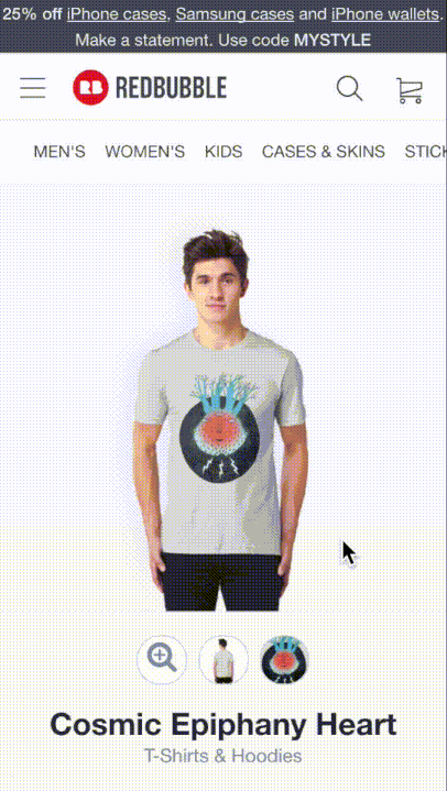
- T-shirt product page
RESEARCH
I ran a series of qualitative interviews with people using Google Shopping on their mobile device. The goal was to better understand their general needs and behaviours.
The sessions were generative, with little guidance. The user could buy from any retailer online and the task was simple: find a t-shirt with a graphics print that you like in Google Shopping.
Some key insights came out of that research:
- Users make decisions, e.g. style, colour and fit, before arriving to a retailer
- Users were happy to buy from unknown retailers but it would take more for them to trust that retailer's site
- Price, delivery dates and returns policy are key factors when users decide on making a purchase
- Reviews are important to establish trust in both the brand and how the product fits
TESTING WITH CONFIDENCE
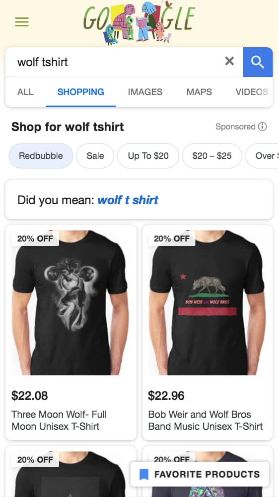
One issue with the above method was that only a few of the participants would naturally land on Redbubble when using Google Shopping. This meant that we didn't have many specific insights around their behaviours on our own product page.
So how might we incorporate the Google Shopping flow in a natural way, but ensure that the users end up on Redbubble?
I came up with the idea to build our own fake version of a Google Search page with simple HTML, CSS and Javascript. It had a search form that would take the user's search query and apply filters to it. This allowed us to alter the search results in Google Shopping to only show results from Redbubble and enabled the user to search and discover products naturally.
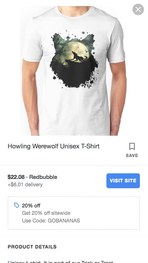
INSIGHTS
The above set up allowed us to explore the behaviours of our Google Shopping users more specifically once they had arrived on Redbubble.
Some key insights from this research were:
- Trust and confidence came from others (reviews and comments)
- Users didn't scroll past half the page
- Configuring the product required a lot of effort
- The majority of options we provided were not relevant
- Users struggled to find key information
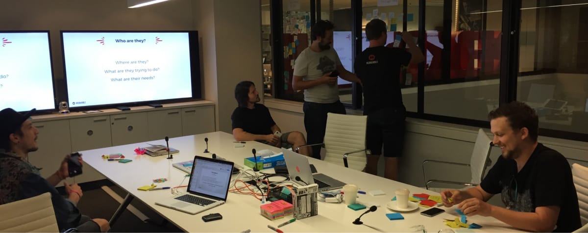
DESIGN SPRINT
To kick things off my product manager and I co-facilitated a three-day design sprint with our product team. We shared and discussed the insights and data. We looked at constraints, aligned on goals and explored new concepts.
VISION
As we brainstormed, great concepts and ideas started to emerge. But they often felt narrow and too focused on a specific user segment.
For example: A new user cares more about reviews than an existing member. And a user coming from Google Shopping has different needs from someone coming from an artist profile page.
This led us to another, perhaps bigger, question:
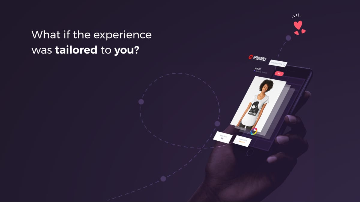
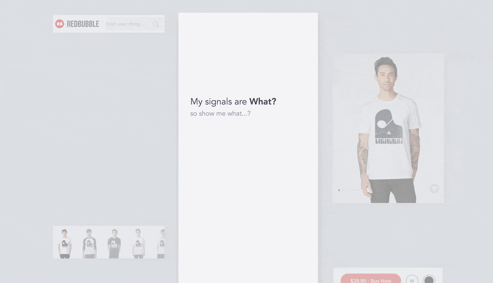
How might we serve the unique needs of our many user segments equally well?
Thus, our vision of a modular experience that would adapt to user signals and intent was born.
SOLUTIONS
Our vision helped guide our decision making both technically and for the interface. It also allowed us to move forward with a focus on the Google Shopping user in mind.
I took the many ideas and prototypes from our design sprint, further refined them for validation, and focused on three main areas:
- Product configuration
- Product discovery
- Product trust
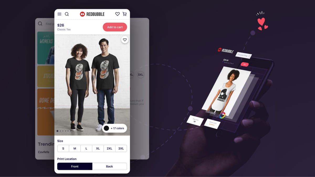
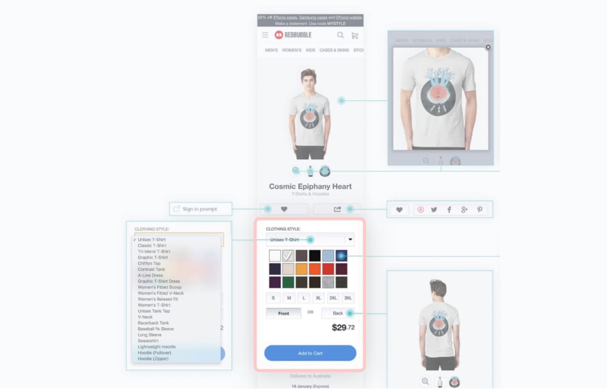
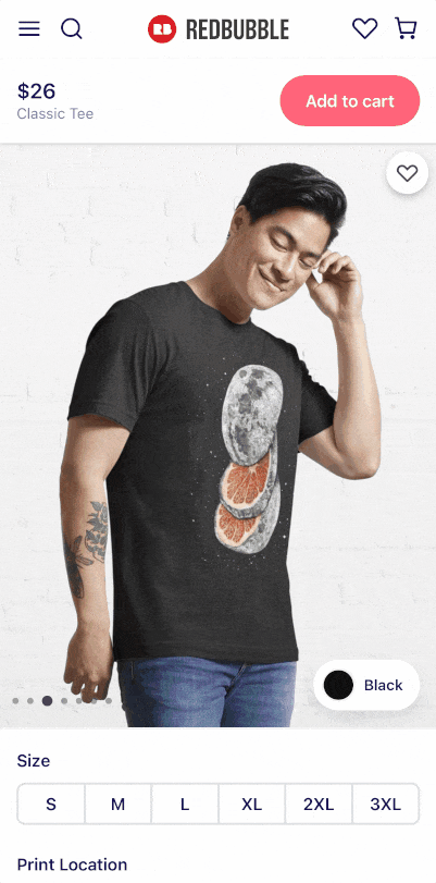
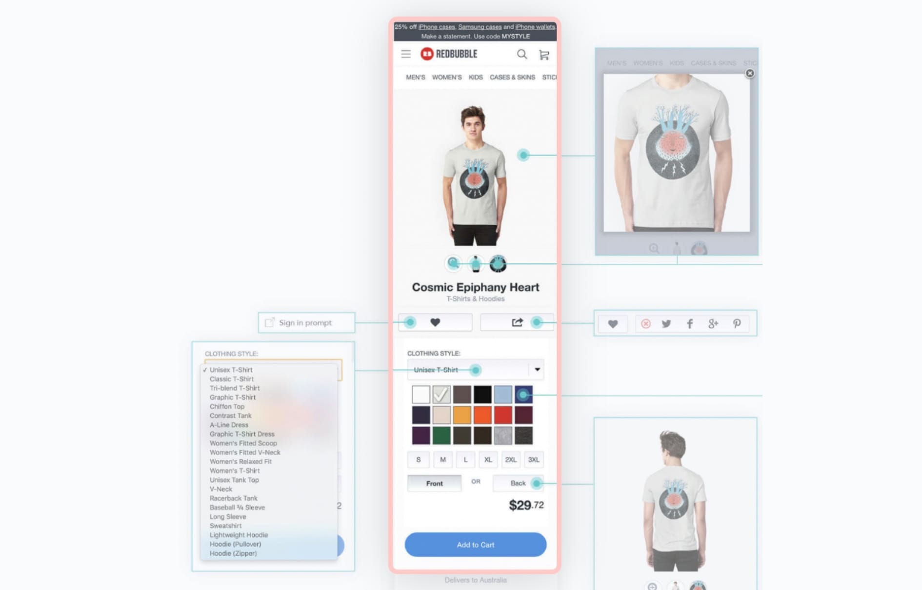
PRODUCT CONFIGURATION
The current experience required the user to scroll excessively to configure the product. Our data showed that the main attribute to change was colour. It also showed that more than 90% of purchases were made on white, black or grey coloured t-shirts and that the majority of purchases were made on the default colour for the product.
I came up with a few ideas and tested three main hypotheses:
- Keeping the colour configurator within the viewport will reduce the time it takes to configure the product
- Sorting colours based on usage will reduce the time it takes to choose colour
- De-emphasising the configuration will reduce cognitive load and make the experience feel less overwhelming
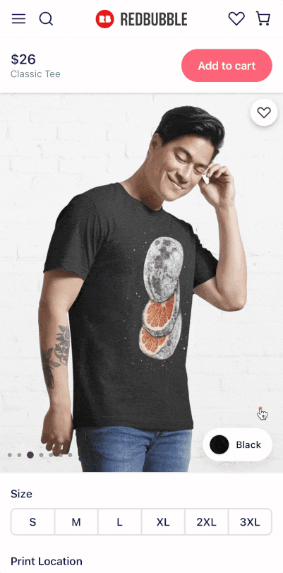
PRODUCT DISCOVERY AND TRUST
A key insight from our research was that many users didn't scroll past the first third of the page. In fact, they would stop where the "Add to cart" button was and scroll back up. At the end of these sessions, I would share my observations with them and ask why that was. They were often surprised themselves, did it mostly subconsciously and would say "I guess I didn't think there was anything relevant below that button".
This was interesting since we had reviews, returns policy and delivery dates below that button: Things I knew were relevant to the user when making purchasing decisions and trusting a new retailer.
I came up with a few ideas and tested three main hypotheses:
- Moving the "Add to cart" button to the top and making it fixed will encourage scrolling
- Grouping information will make it easier to scan and find
- Emphasising important content will reduce the time it takes to make a purchasing decision
OUTCOMES
The overall initiative was a massive undertaking. We were able to break down and sequence our delivery with incremental additions to the experience and measure our impact along the way.
In the end our solution had a big impact on our key metrics and also triggered new and exciting initiatives:
- Our MVP saw record increases in conversion and add to cart rates
- The new platform was adopted across the organisation
- Our visual language was refined and evolved
- We established the foundations for a Design System